Aethos
Figma
2025

Overview
Aethos is a user-centric Web3 wallet designed to demystify decentralized trading for beginners. In collaboration with fellow designer Raz, we stripped away the complexity of traditional DEX interfaces to create a transparent, fear-free experience for advanced features like Limit Orders.
We treated this project like a remote studio.
The Split: While Raz focused on the Core Wallet Architecture (Dashboard, Assets), I took ownership of the Transaction Flows (Swap, Limit Orders, History).
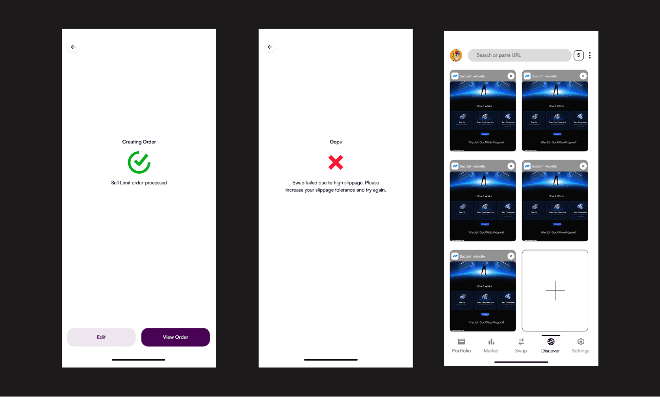
The System: Before designing a single screen, we established a Shared Design System. We defined our typography, "Glassmorphism" layer styles, and color tokens (Success Green, Error Red, Brand Purple) to ensure that my transaction screens blended seamlessly with his dashboard.
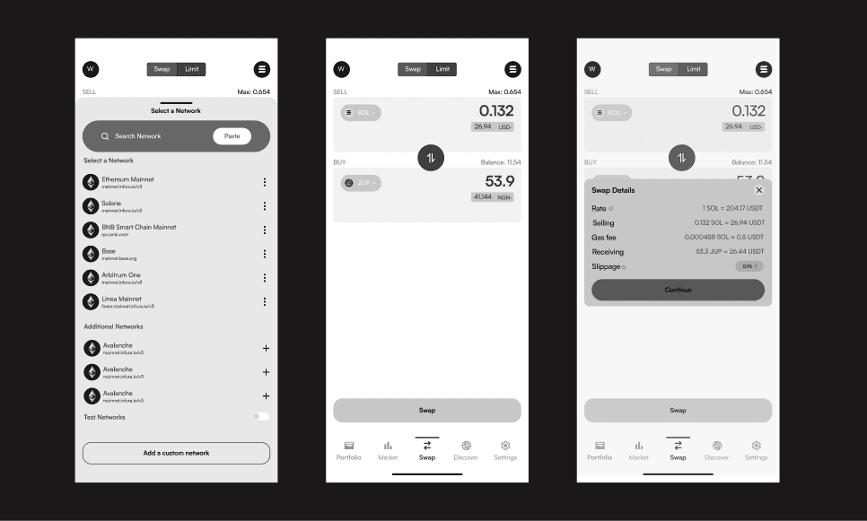
Wireframes


High Fidelity


The Challenge
Limit orders (buying at a specific price) are powerful, but most DEX interfaces are cluttered with confusing charts and jargon. New users often struggle to understand trading pairs (e.g., "Am I buying SOL or selling JUP?") and fear making irreversible mistakes. My Goal: Simplify the Limit Order flow so a beginner can trade with the same confidence as a pro.
A. The Limit Order Input: Solving the "Pair" Confusion
(Visual: Your "Buy/Sell" screen) The Insight: Beginners often confuse price inputs. My Design:
Clear Separation: I separated the "Buy Limit" action into two distinct fields: Price (What I want to pay) and Receive (What I get).
Local Currency Toggle: As discussed in my research, I added a toggle to view prices in Fiat (e.g., USD/NGN), anchoring the crypto value to real-world money.
B. Open Orders: Killing the Clutter
(Visual: The "Open Orders" card/list) The Problem: Most exchanges show a complex "Order Book" that looks like a spreadsheet. My Solution:
Simplified Card: I designed a clean "Open Orders" card that only appears when active.
Human-Readable Data: Instead of raw data, it clearly states: Pair (JUP/SOL) → Status (Open) → Amount.
C. Order History: The Vertical Table
(Visual: The "History" list) The Logic: Users need to scan their past activity quickly. My Design:
Vertical Scanning: I utilized a vertical table layout (as validated in my research) rather than horizontal scrolling cards.
Status Indicators: I used clear color coding (Green for Filled, Grey for Canceled) so users understand the outcome of their trade in milliseconds.